Depth Chart Deception: What DEX Liquidity Displays Are Hiding From You
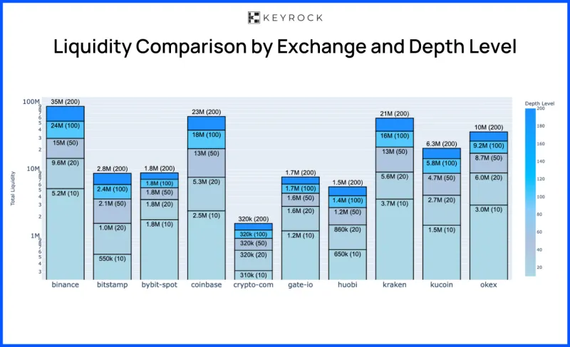
Photo: cryptocurrency DEX trading chart liquidity depth analysis, via keyrock.com
There is a particular kind of confidence that comes from glancing at a DEX depth chart and seeing what appears to be a thick, healthy order book on both sides of the spread. Green bars stacking up on the bid side. Sell walls that look manageable. A mid-price that seems stable. For many retail participants in the US crypto market, that visual is enough to trigger a buy decision. It probably should not be.
The relationship between what a DEX displays as liquidity and what a trader can actually extract at a reasonable price is far more complicated — and far more dangerous — than most platforms choose to advertise. Understanding that gap is not a minor technical detail. It is often the difference between a profitable trade and a position that quietly bleeds out the moment you try to close it.
How Concentrated Liquidity Pools Distort the Picture
Since the introduction of concentrated liquidity models — popularized by Uniswap v3 and adopted across numerous competing protocols — liquidity providers have been able to deploy capital within specific price ranges rather than spreading it uniformly across the full curve. This design is efficient for LPs who want to maximize fee capture. For traders reading depth charts, however, it creates a structural problem.
The liquidity visible at or near the current price may be extremely dense, giving the appearance of a deep and resilient market. But that concentration drops off sharply once the price moves even modestly outside the active range. A trader attempting to exit a large position does not simply consume the liquidity at the current price — they push through it, and what lies beyond may be a near-empty pool that sends the execution price into freefall.
In practical terms, a token might display what looks like several hundred thousand dollars in available depth, yet a $40,000 sell order could generate five to ten percent slippage once the trade moves past the concentrated band. The chart showed the liquidity. It just did not show you where it ends.
Fragmentation Across Venues: The Multi-Pool Problem
Another layer of complexity comes from the fragmentation of liquidity across multiple pools and protocols. A single token might have active pools on Uniswap, SushiSwap, Curve, and several newer AMM platforms simultaneously, with each pool holding a fraction of the total available liquidity. Aggregators like 1inch or Paraswap attempt to route trades across these venues to minimize price impact, but aggregation is not the same as consolidation.
When a trader evaluates depth on a single DEX interface, they are typically seeing only that venue's pool — not the aggregate picture. More critically, the aggregator's routing algorithm may split an order across pools, and the actual execution price across all legs may diverge from any individual depth chart's implied slippage estimate. During periods of elevated volatility or when a token is rapidly losing interest, liquidity providers can and do withdraw capital from pools within the same block they receive a withdrawal signal. What the chart showed thirty seconds ago may no longer exist.
This is not hypothetical. Experienced traders in the US DeFi space have documented cases where a token's aggregate on-screen liquidity looked sufficient for a mid-sized exit, only to find that actual execution consumed far more slippage than any single-venue depth chart suggested.
Flash Loan Mechanics and Temporary Liquidity Inflation
The problem extends further when flash loans enter the picture. Flash loans allow a borrower to access enormous sums of capital within a single transaction block, use those funds to interact with liquidity pools, and repay the loan — all atomically. While flash loans have legitimate uses in arbitrage and collateral management, they also create conditions where a pool's apparent depth can be temporarily inflated or manipulated.
A sophisticated actor can use a flash loan to deposit liquidity into a pool, creating the appearance of depth at a specific price point, execute a trade that benefits from that artificial depth, then withdraw the liquidity — all before the next block confirms. From a charting perspective, a trader monitoring the pool in real time might see a momentary spike in available liquidity that disappears as quickly as it arrived. For anyone whose order routing was influenced by that momentary depth reading, the outcome can be significantly worse execution than expected.
This class of manipulation is difficult to detect without on-chain forensics tools, and most retail traders are not equipped with those tools at the moment of execution.
Practical Signals for Assessing True Liquidity
Given these structural blind spots, the question becomes practical: how should a trader assess real available liquidity before committing to a position?
First, simulate before you execute. Most major DEX interfaces and aggregators offer a trade preview that calculates expected slippage for a given order size. Run that simulation at your intended exit size — not your entry size — before entering a position. If the slippage estimate at your expected exit volume is uncomfortable, the entry is already compromised.
Second, examine pool composition over time, not just at the moment of entry. Tools like Dune Analytics dashboards and protocol-specific liquidity trackers can show whether a pool's total value locked has been stable, growing, or gradually draining. A pool that has lost thirty percent of its TVL over two weeks is a pool that may not be able to absorb your exit.
Third, pay attention to the ratio of daily trading volume to total liquidity. A healthy ratio suggests that the pool is actively used and that LPs have reason to maintain their positions. A token that shows high TVL but very low trading volume may have stale liquidity that has not been stress-tested by real order flow — and stale liquidity behaves unpredictably when a large order arrives.
Fourth, check whether liquidity is concentrated in a single wallet or a small cluster of LP addresses. On-chain data frequently reveals that what looks like broad liquidity provision is actually controlled by one or two entities. If those entities withdraw simultaneously — as they sometimes do when insider knowledge of a negative event circulates — the pool empties faster than any depth chart could have warned you.
The Exit Is the Trade
In traditional equity markets, US investors generally have access to exchange-level order book transparency, regulatory protections around market manipulation, and execution standards that provide meaningful price certainty for most retail order sizes. Decentralized markets offer none of those guarantees. The tradeoff for permissionless access and composability is that the burden of liquidity due diligence falls entirely on the trader.
The depth chart is a starting point, not a conclusion. It tells you what liquidity looks like at a moment in time, on a single venue, under current conditions — none of which may hold when you actually need to sell. The traders who consistently protect their capital in DeFi environments are the ones who have internalized a simple principle: the entry is optional. The exit is the trade.
Before the next position is opened, the first question worth asking is not whether the chart looks liquid. It is whether the exit has been modeled honestly, at realistic size, across the full range of conditions that might exist when the time to close actually arrives.